5 Digital Signage Content Best Practices for Corporate and Workplace Environments
5 Digital Signage Content Best Practices for Corporate and Workplace Environments
In corporate spaces, digital signage is only as effective as the content running on it. The screens can be beautiful. The install can be flawless. But if the message is unclear, inconsistent, or forgettable, people will walk right past it.
Think of signage content like the soundtrack in a movie. When it’s done well, it guides the experience without calling attention to itself. When it’s off, everyone notices and not in a good way.
Below are five digital signage content best practices we use when planning workplace communication, lobby experiences, and branded environments.
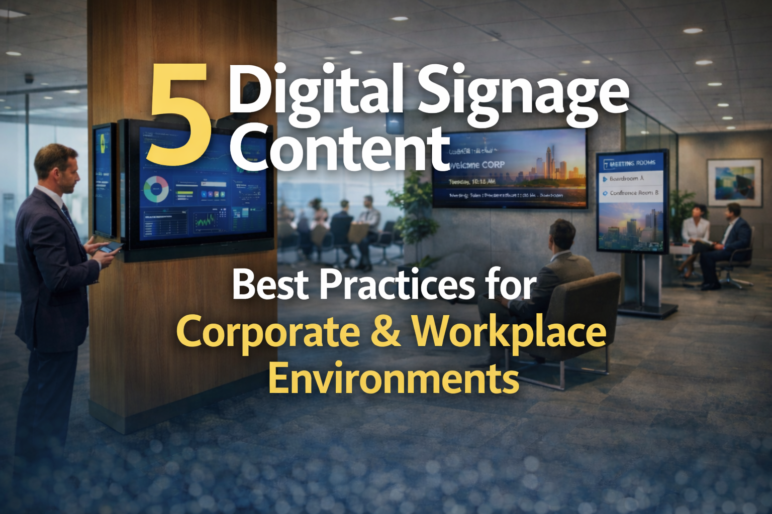
1. Keep every screen on brand and on message
Corporate signage content should feel like it belongs in the building. That means your fonts, colors, tone, and visual style match what people see in your workplace branding, presentations, and printed materials.
A simple rule: if someone snapped a photo of your screen, it should look like it came from your brand team, not a random template library.
- Use the same logo lockups and brand colors used elsewhere in the space
- Stick to 1–2 fonts and consistent headline sizing
- Keep your voice consistent with internal comms and brand guidelines
2. Design for the glance, not the stare
Most people do not stop to read. They glance while walking, waiting for an elevator, grabbing coffee, or checking in at reception. Your content has to land fast.
Think of each screen like a road sign. It should communicate one primary idea clearly and quickly.
- One core message per slide
- Short headlines, minimal copy
- High contrast and readable type at a distance
3. Use motion intentionally
Motion grabs attention, which is useful, but it can also create visual noise if everything moves all the time. The goal is to guide focus, not create distraction.
We recommend subtle movement that supports the message. A smooth transition. A small animated icon. A short video loop that reinforces a theme.
- Keep animations simple and consistent
- Avoid constant scrolling text for key messages
- Use video when it adds meaning, not just movement
4. Match content to the location and the audience
A lobby screen and a breakroom screen have different jobs. A lobby welcomes and orients. A breakroom supports internal communication. A hallway screen can reinforce culture or share timely updates.
Before you build content, ask one question: what is the viewer doing right here, right now?
- Lobbies: welcome messages, directories, visitor guidance, brand credibility
- Cafes and break areas: events, announcements, culture, quick wins
- Corridors and transitions: directional cues, reminders, brief updates
5. Build a simple content rhythm and keep it fresh
Great signage content is not one big launch. It’s an ongoing rhythm that keeps screens useful and relevant. When content stays the same for too long, people stop seeing it.
We recommend setting a schedule that is realistic for your team and your workflow, then building templates so updates do not feel like reinventing the wheel.
- Create monthly templates for recurring content like events and announcements
- Rotate a mix of evergreen and time-sensitive messages
- Review performance quarterly and refresh what is no longer serving the space
What strong corporate signage content does for your space
When digital signage content is clear, on brand, and built for real-world attention spans, it supports the entire workplace experience. People get oriented faster. Communication feels easier. The space feels intentional.
If you’re planning a digital signage rollout or you want to improve what’s currently on your screens, our team can help you connect content strategy with the physical environment, including wayfinding, workplace branding, and architectural signage.
Contact BLR to talk through your goals and get a practical plan for your space.